Layout Examples

Storyboard Popis
Storyboarding Tips
Text z Príbehu
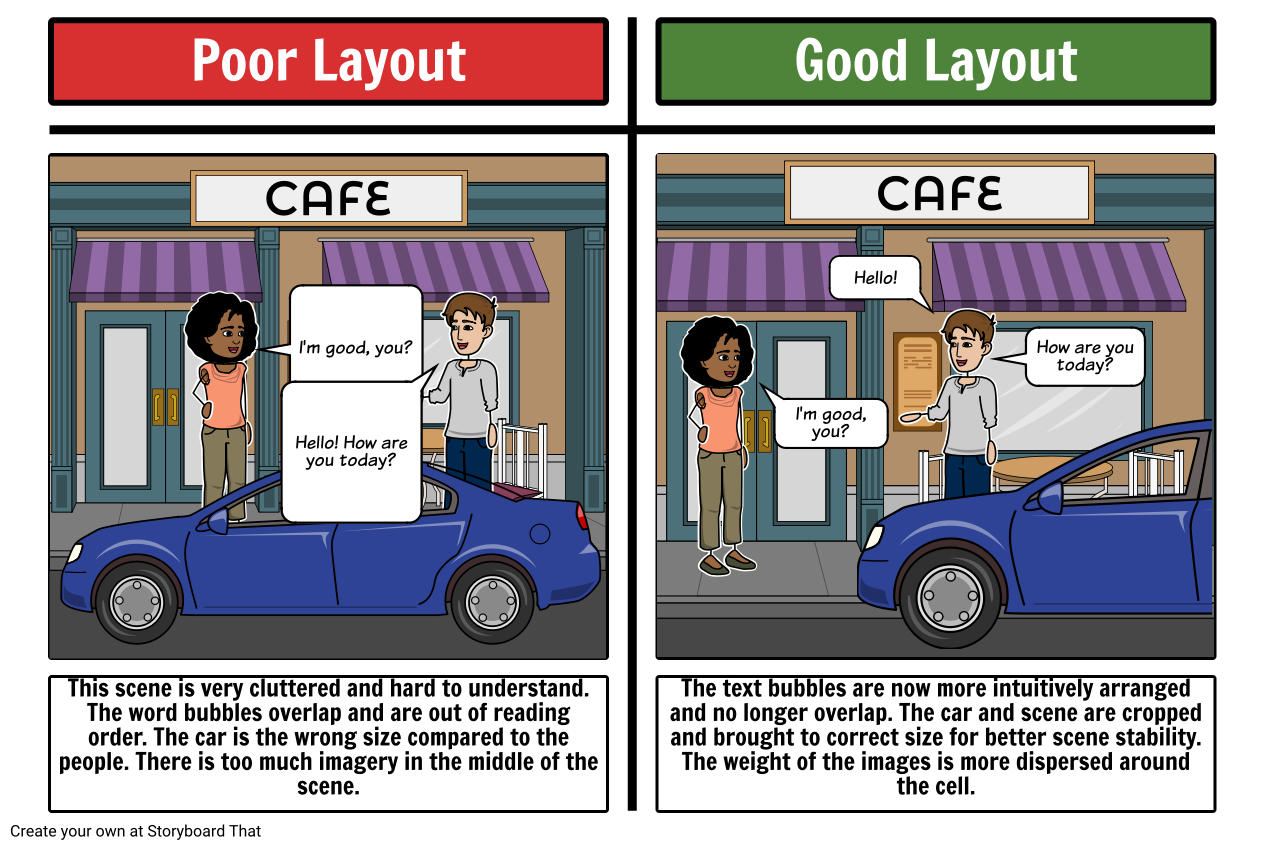
- Poor Layout
- I'm good, you?
- CAFE
- Hello! How are you today?
- Good Layout
- I'm good, you?
- CAFE
- Hello!
- How are you today?
- This scene is very cluttered and hard to understand. The word bubbles overlap and are out of reading order. The car is the wrong size compared to the people. There is too much imagery in the middle of the scene.
- The text bubbles are now more intuitively arranged and no longer overlap. The car and scene are cropped and brought to correct size for better scene stability. The weight of the images is more dispersed around the cell.
Bolo vytvorených viac ako 30 miliónov storyboardov

